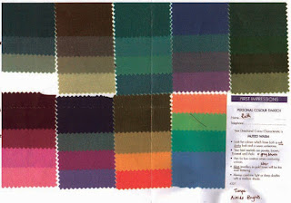
I went to see the lovely Kate yesterday and she used her colour draping swatches to see which palette would be most flattering for me. Kate uses a system which has the 6 directions Deep/Light, Warm/Cool, Bright/Muted out of which a person usually has a main direction, and then can have a secondary and a tertiary. So its a bit different to the 4 season approach if you have come across that.
For the first part we sat outside for the natural light and I got to look in the mirror as we went as I wanted to tune myself in and understand why one colour swatch was better than another. I varied a bit but the one fairly consistent element was Muted. Also Warm slightly edged it over Cool and neither Deep nor Light was better than the other. So this gave me Muted with a slight secondary of Warm.
It was obvious that all the bright and clear colours had that effect where people notice your shirt first and you somewhere afterwards.
We were looking for subtle changes in the skin tone between the colours on some of the others, did something bring out the redness, did the darker area under my eyes become more or less obvious, did my skintone appear smooth or bumpy. It took a little while for me to tune in to the nuances of this, and there were some where I could hardly tell, but most I could see the difference for myself.
I understand that this means I need to keep my colours slightly greyed, which explains why a bright pinky coral tee shirt looked great after I'd washed it by accident with something dark, just knocking the colour down a notch!
This palette doesn't contain black, but Pewter, Brown, Khaki and Grey blues are alternatives for trousers, jackets, coats, and so on. It contains off white and some lighter colours for tops/blouses.
Kate showed me lots of ways to mix similar toned colours together, I particuarly liked the various pink/burgundy shades together and all the teals together.
A Taupe was particularly good (did you know that Taupe is french for Mole, I didn't).
This is a great colour as it contains grey and brown and mixes in with anything in the palette.
Anyway I see some interesting wardrobe and fabric stash decisions coming up, but also some fun opportunities to use some of those muted colours.
The whole palette reminded me of muted scottish landscapes, blues, greens, browns, greys, purple from heather and a softness to the light because of the angle of the sun.
This is going to be interesting!


6 comments:
I love your color swatches! I may have similar coloring. I've had my colors done 3 different times. there was always some variation in what was recommended, but more consistency than not. I definitely don't wear black well! too bad I suppose because you can get ANYTHING in black. but I love the cheery colors I can wear, and it looks like your colors are cheery too.
Have fun! I know I always do when I get to rethink my color combinations!
Julia
It was an absolute joy to work with you on your colouring Ruth. It was an interesting, learning experience for me too. You have quite a mixture of cool eyes, warmer lips and skin, deep hair and light skin, so you have all of these things going on to some extent. But the one constant was that muted was always better than bright.
I think you will have fun with your new Muted colour choices.
Love your colors - I'm very close to yours. Thanks for sharing
Marciae
What a fun thing to do! Can't wait to see all the lovely things you'll be making in your colors!
What an interesting time you had! It will be fun watching your new palette come not play!
Oops, come into play!
Post a Comment